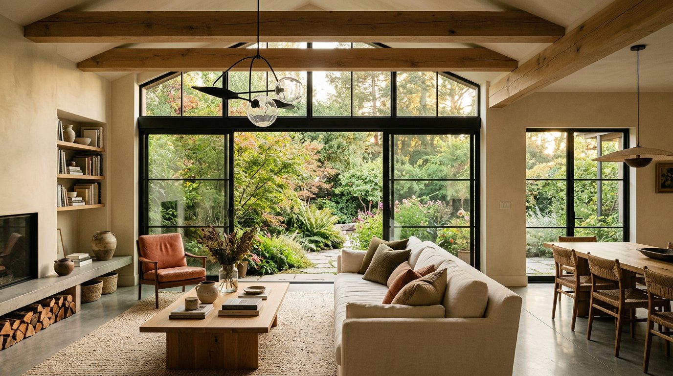
A calm room doesn't have to be all white, and a personal room doesn't need every color you love at once. A considered palette gives a space a sense of ease while leaving room for the objects, textures and memories that make it yours.
Begin with what is already there
Notice the features you plan to keep: flooring, a stone fireplace, a favorite piece of art or a view through the window. These details can suggest a starting point. Pull a few soft tones from them, then let one or two stronger colors add definition.
It can help to gather material samples in the room itself. A paint color looks different in morning light, under warm lamps and beside the wood or tile it will live with. Spend time with samples before settling on a direction.
Balance warm and cool
Most rooms feel more layered when they bring different temperatures together. A soft warm wall color can feel fresh alongside cool green foliage; pale oak can bring softness to a crisp white space. The aim is not perfect matching, but a comfortable conversation between finishes.
Use texture as a quiet accent
Linen, wood grain, woven shades, matte ceramics and natural stone add variation without asking for more color. Textural layers make a restrained palette feel generous and lived in.
Most of all, leave room for your own preferences. A collected room should reflect the people who use it. If a favorite hue makes you happy, bring it in through a cushion, a painted cabinet or a piece of art. The most lasting palette is one that feels natural to come home to.
← Back to the journal